Site performance is paramount to success in the digital age.
If you have a slow site there’s a good chance that people are leaving quicker than they should.
The good thing about living in this day and age is that you have access to many great (and free) tools to test your site's performance.
Our first step when running a client through our Merchant Performance Audit is to put their store through a site performance testing tool.
A site performance tool will give you an overview of key performance metrics that Google focus on when ranking and scoring websites.
Now, we don't know all the metric points but following the recommendations directly from Google will no doubt help when it comes to ranking.
And while some people only use one testing tool for the analysis we prefer to cover all bases and use two, Googles Own (Google Page Speed), and GTMetrix.
Googles Page Speed will cover the main areas that you need to look at, while GTMetrix will provide a comparison point to reference against as a before and after (When you've done your magic!).
There's a lot of metrics to cover and not all are relevant (don't chase the 1%'ers!)
You should be focusing on the following metrics.
- Image sizing and best practices
- Reducing JS and CSS sizing
Bonus that Google/GTMetrix doesn't cover but you SHOULD look into.
- Remove plugins that aren't used
Image sizing and best practices
Image sizing has a huge impact on your sites performance.
Sites with lots of large images (Combined size north of 4MB) will take way longer to load than those which are correctly sized and compressed.
For most of us who have decent internet speed, you might be thinking "this loads quickly" but you're forgetting about mobile networks (3G/4G networks) -- which are typically slower than your at home network.
Don't forget that the majority of eCommerce stores main source of traffic is from mobile devices (Check your Google Analytics if you don't believe me!).
We suggest to focus on the following set of best practices
- Image size
- Image type
- Image height and width and
- Image pre-loading
That's it!
Lets dive into an example.
If you have a hero image (the main image on your home page used to showcase promotions or a hero product) you should have several different versions of the file, based on different screen sizes. Mobile, Desktop and HD (4k).
In the example below you can see how the image is cropped different for mobile vs desktop.

Based on the above I would suggest that you:
- Upload compressed HD images (Based on recommendations from the theme developer or your developer). Shopify and BigCommerce will typically create multiple versions of these images for different screen sizes. If you don't use Shopify or BC you may need to upload different versions ☹️
- Upload correctly cropped images for different resources (mobile thumbnails vs desktop thumbnails will look VERY different) See above for example.
- Upload any product or lifestyle image as a JPEG, not a PNG (Caveat: where there's no need for transparency!). Stick to the above filetypes, as the new recommended filetypes aren't natively available on the platform as of yet!
If you're still not sure about what size or crop, I would consult with your theme documentation (most will have a list of suggested image sizing based on the element) or reach out to your developer.
Otherwise, if you're working with a 3rd party to create image assets (graphic designer), let them know how your images should be delivered in what size, crop and filetype (this will save a lot of back and forth).
Feeling technical and want to DIY?? Google has a great link on best practices to serve responsive images Enjoy!
The next area to cover is setting width and height for images.
When the browser loads a webpage, it will allocate space for each element on the page. The exception is images, which are loaded only after the browser has downloaded it's dimensions.
When you don't specific the dimensions of an image explictidly, it will cause the page to dramatically push down all the elements once the browswer figures out the viewport and dimensions of the image.
This isn't ideal as it will cause the browser to jump around (terrible user experience)
This is called Cumulative Layout Shift.
This can easily be fixed by adding some code on the
affected images e.g. <img width="300" height="300"/>.
The good news is if you're working with a modern or high-quality theme you should already have this added out of the box; if not this may require some development work to resolve psst we can help.
Next issue to solve. Preloading images.
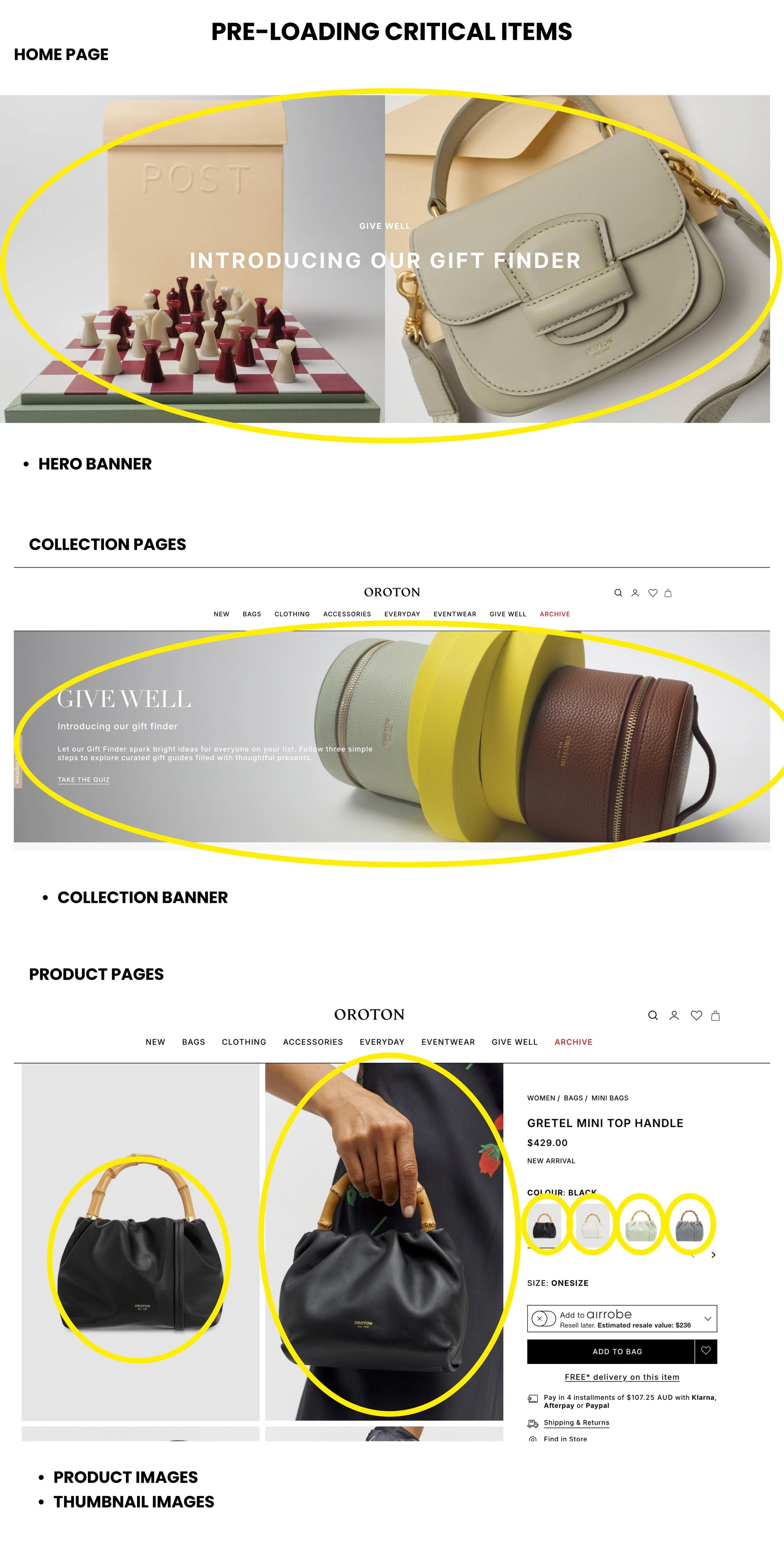
The pre-loading of images is another critical element to the Google Page Speed algorithm. Think of pre-loading as selecting which critical elements (images) should be downloaded ASAP. Critical items are those that are above the fold on a home page/product or collection page. This also extends to scripts and libraries for assets.
Example below

A tip here is to ONLY preload necessary images.
Once you've identified the images that you want, you'll need multiple images sizes. (mobile, desktop, HD etc.). This is the KEY for loading images relevant to the medium being used.
Example code below
<link rel="preload" as="image" href="important.jpg" imagesrcset="important_400px.jpg 400w, important_800px.jpg 800w, important_1600px.jpg 1600w" imagesizes="50vw">
href="important.jpg"is the file name of the original fileimagesrcset="important_500px"is the versions of the images required for different screen sizes.- The
800wthe w is the screen width number in which the image is loaded against. 400x for mobiles, 1600w for HD devices etc.
Once you've figured out what assets you want pre-loaded add these into the head of the document
<head><link rel="preload" as="image" href="important.jpg" imagesrcset="important_400px.jpg 400w, important_800px.jpg 800w, important_1600px.jpg 1600w" imagesizes="50vw"></head>
If you're feeling in a DIY kinda mood and you want more info, here's an in-depth guide from Google on pre-loading assets How to preload images from Google or if this is too hard or you don't have time chat with a developer to implement.
Reducing JS and CSS sizing
Once you've compressed your images, set up pre-loading and set fixed sizes for your assets, the next unlock is to reduce the sizing of your Javascript (JS) and Cascading Style Sheets (CSS) assets.
Without getting too deep into what JS and CSS do, they're essentially responsible for making your site
- a) look pretty and
- b) function dynamically (accordions, sliders etc.).
Without JS and CSS you'd have a very boring non-interactive site!
There's some sites that you can use to reduce the size of your libraries but I would throw caution. Unless you know what you're doing, you can easily break your site.
If you're feeling adventurous you can look into using build systems that will automate this process, but will require someone to setup, configure and maintain. Look into the following Gulp or Grunt
If you want to get your own hands dirty look into How to remove unused JavaScript by Google
Otherwise we can help here
Remove plugins that aren't used
Lastly a metric that may not pop-up directly in Google Page Speed/GTMetrix is related to plugins/extensions. While many people believe that plugins/extensions are king and should be used for everything, not all are created equally.
As a rule of thumb, we always recommend using as much native platform functionality before installing another plugin/extension. Each new plugin/extension will load its own JS and CSS library, slowing down the loading of your site.
I would suggest going through the list of your plugins frequently and removing those that aren’t adding value; or if there’s a small plugin that you need, it might be worth chatting with a developer to see if they can implement the feature on your site without all the additional load -- save yourself some $$ and resources.
In conclusion
I hope you got some value out of the above. While this list isn’t exhaustive and comes with a lot of nuance, it should help you to improve your page speed and performance.
If you found this useful please don't forget to share.
Otherwise if you do need a hand with the above, please don’t hesitate to reach out Click here to book in a time to discuss


